2026 · Product Design
ZETAGON
A renewable energy asset management and intelligence platform designed entirely in Figma. From an empty canvas to a complete 0 → 1 design system and interactive prototype for solar, wind, and energy storage operations.
Role
Product Designer
Tools
Figma
Scope
0 → 1 Platform
Year
2026
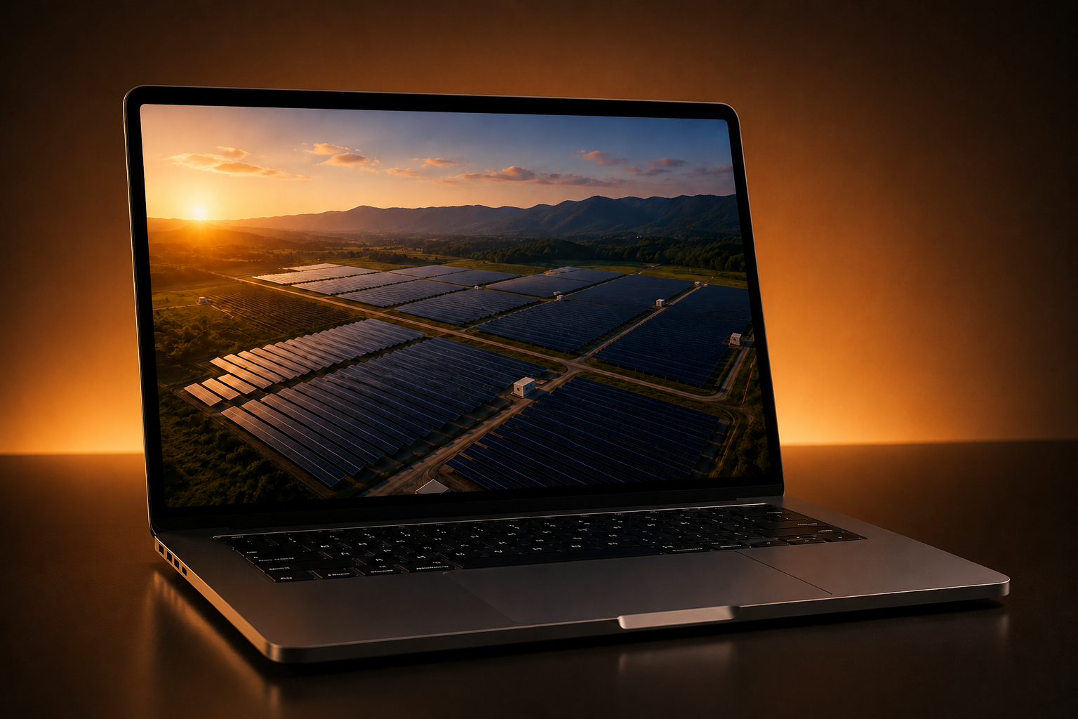
No screens. No system. No starting point.
Zetagon is an AI-driven renewable energy management and lifecycle intelligence platform. When I began this product design engagement, I built everything entirely in Figma from scratch. There was no existing design system, no previous version to reference, and no hand-off from another designer.
Every decision—from foundational typography scales and dark-mode colour tokens to complex telemetry monitoring workflows—had to be conceptualized and validated from the beginning. The objective was an enterprise-grade platform that delivers real-time visibility across solar, wind, and storage assets while maintaining intuitive simplicity for operators.
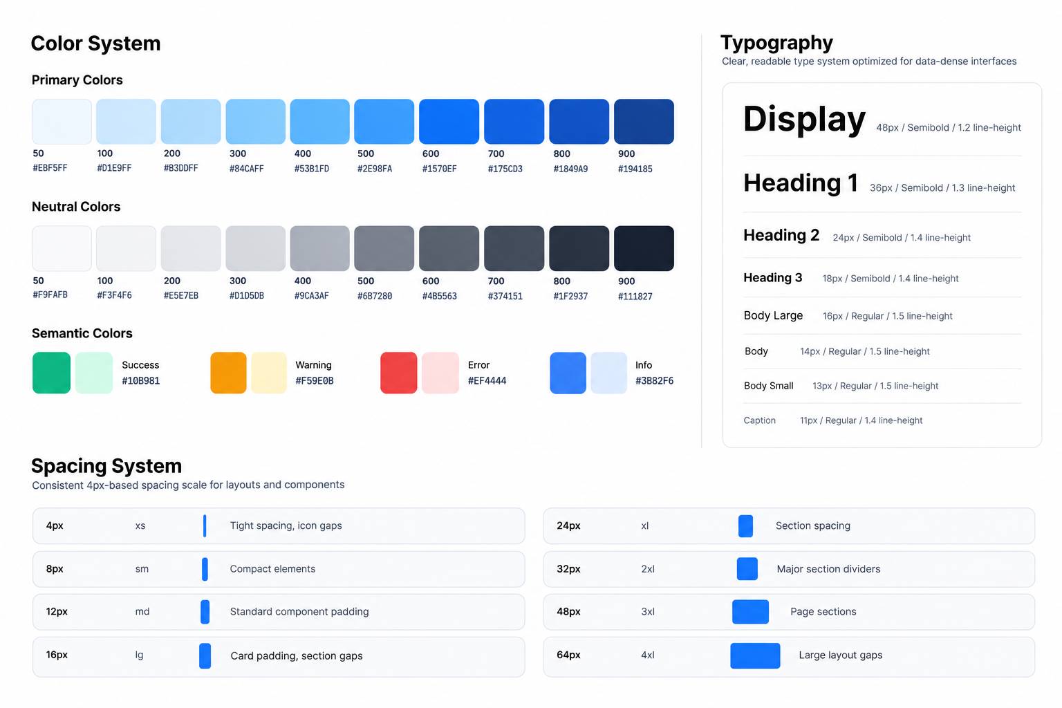
The first thing I worked on wasn't a screen. It was the design system.
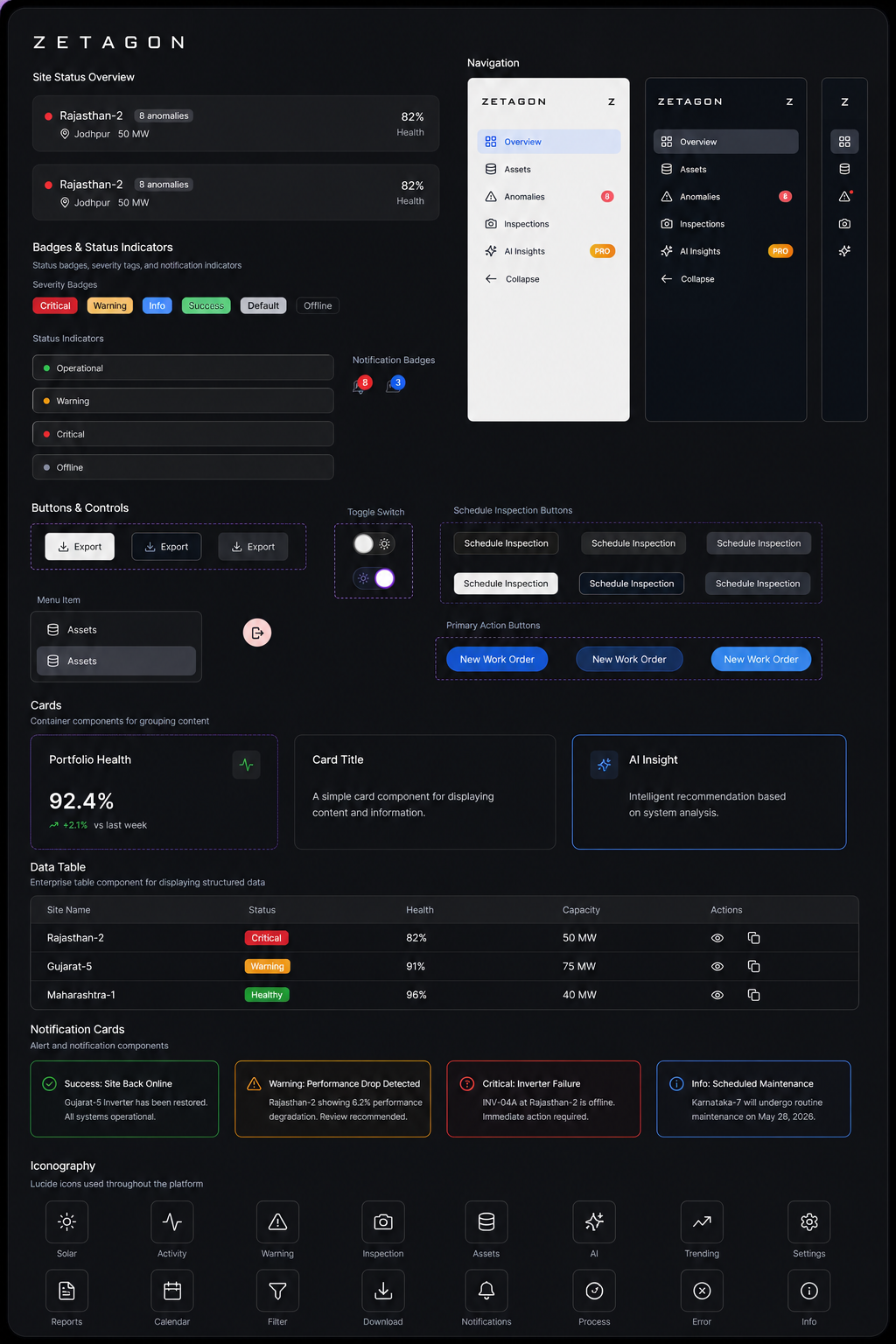
In high-density industrial dashboards, inconsistency leads to cognitive fatigue and operational mistakes. So before creating individual screens, I defined the core Zetagon design system: typographic scale, dark surface tokens, status palettes (online, warning, anomaly, offline), buttons, inputs, data cards, telemetry tables, and navigation structures.
Investing upfront in component architecture saved significant time later. Once a component existed in the Figma library, assembling complex telemetry dashboards and anomaly inspection views became frictionless and uniform.
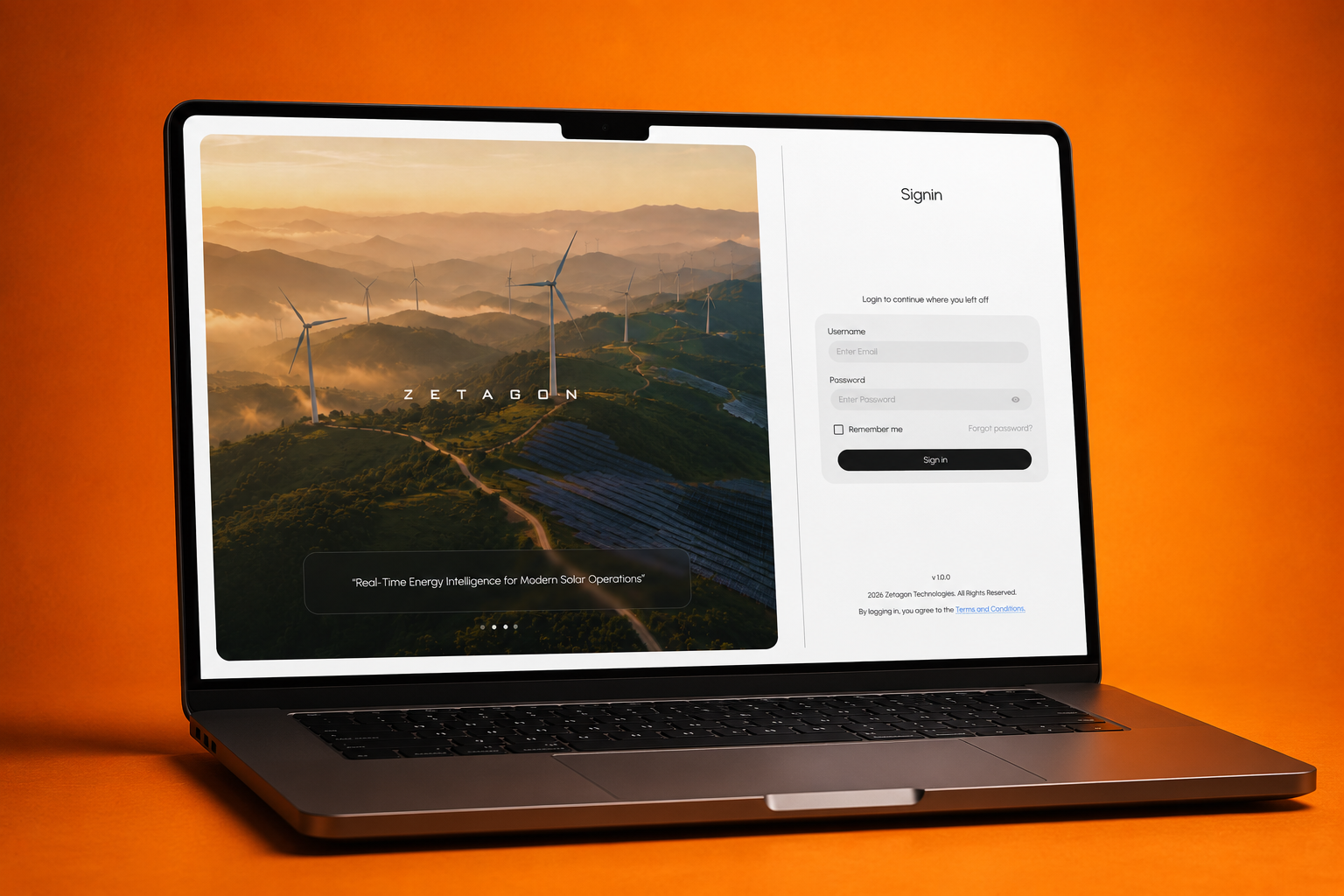
The first screens weren't the most complex. But they set everything else.
I started with the authentication flow, role-based access onboarding, and foundational layout frames. These initial screens established the visual density, surface elevation contrast, and dark-mode aesthetic required for engineers and asset managers monitoring critical clean energy infrastructure around the clock.
Refining these foundational screens early ensured every subsequent module inherited a clear, unified visual standard.
The dashboard changed more than any other screen.
The Zetagon energy dashboard is the mission control centre for operations teams, summarizing live generation yield, capacity utilization, grid curtailment, and site health. It went through more iterative cycles than any other screen in the product.
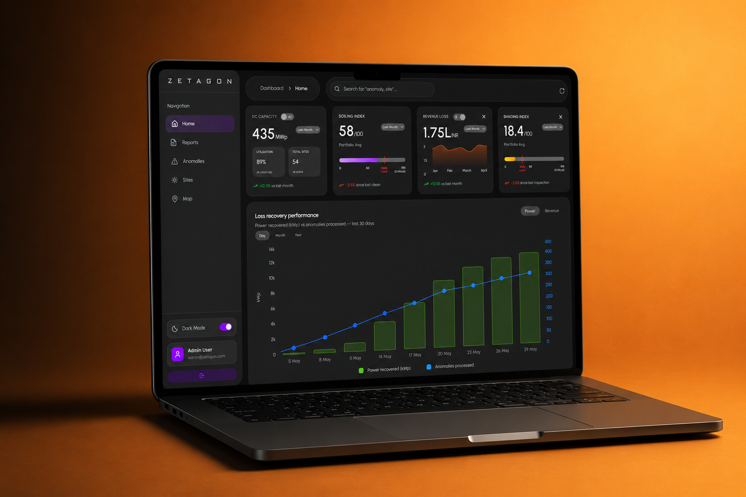
Critical metrics like real-time power output (MW), performance ratio (PR), and weather diagnostics required careful visual balance. I tested multiple chart arrangements, quick-action rows, and card layouts—continually comparing versions side by side to ensure operators could detect critical site anomalies in seconds.
Every page had to feel like it belonged to the same product.
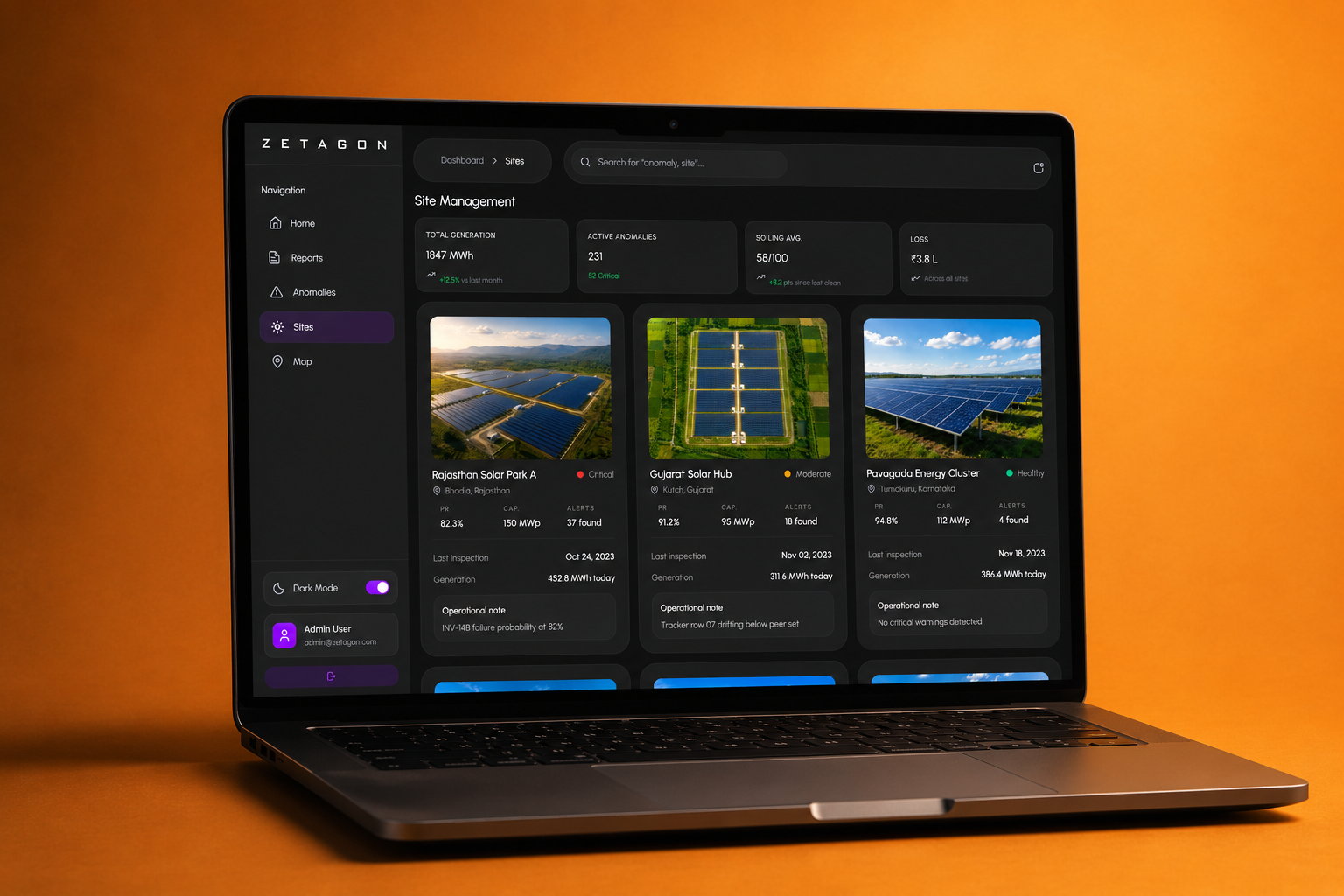
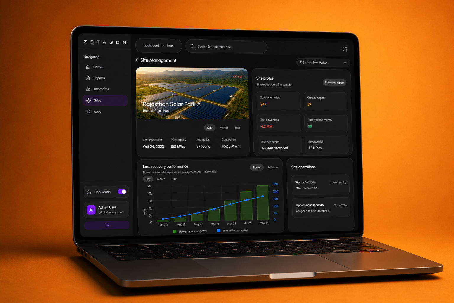
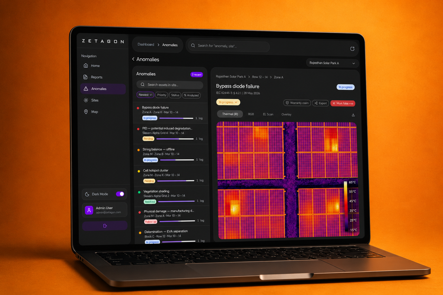
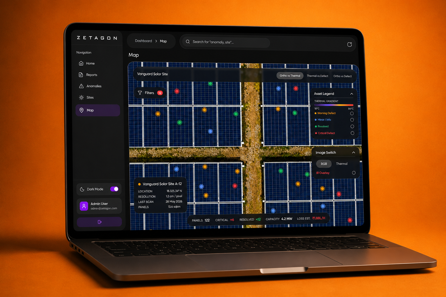
With the central dashboard stabilized, I expanded the platform into dedicated operational modules: multi-site asset portfolio management, AI anomaly detection and thermal diagnostics, interactive geographic mapping, and automated energy yield reports.
Each module presented unique data density challenges, but the governing rule remained constant: reuse and adapt existing design system tokens before creating new components. That discipline ensured the user experience remained coherent across all portfolio levels.
No single decision shaped this project. Hundreds of small ones did.
The design evolved through deliberate refinements rather than abrupt shifts, with each iteration improving usability, data readability, and visual clarity:
- Calibrating surface contrast and status hues for low-light control room environments
- Restructuring telemetry tables so primary generation delta columns read first
- Refining responsive metric cards so dense charts scale cleanly across displays
- Eliminating redundant visual chrome to prioritize operational data visibility
- Optimizing anomaly severity indicators to reduce operator alert fatigue
- Testing multi-level navigation depth to streamline site drill-downs
Every component was part of the product, not separate from it.
Every button, form input, status pill, and data visualization card was designed in the direct context of Zetagon's live workflows. If a component could not serve multiple operational scenarios across monitoring, site management, or reporting, it was consolidated.
This strict component governance kept the design system lightweight and guaranteed visual harmony across all 0-to-1 screens.
The prototype revealed what the static screens couldn't.
After linking the screens into a comprehensive interactive Figma prototype, I identified subtle ux friction points that were invisible on static artboards—such as navigation flow continuity and transition cues between fleet overviews and granular asset diagnostics. Several testing rounds later, the end-to-end user experience felt cohesive and robust.
↗Interactive. Click through the product above.
The most important thing wasn't any individual screen.
Looking at the final prototype, no single screen stands out as the moment it came together. The system, the components, the layouts and the interactions grew alongside each other, each one shaping the others.
Almost every page changed more than once. That wasn't a sign of indecision. It was the process. I kept comparing, questioning and adjusting until the product felt like one unified platform, ready for renewable energy teams to manage large-scale clean power assets.
Frequently Asked Questions
What is Zetagon?
Zetagon is an intelligent renewable energy asset management and lifecycle intelligence platform designed to unify monitoring, telemetry diagnostics, anomaly detection, and operational reporting across solar, wind, hydro, and battery energy storage systems (BESS).
Who designed the Zetagon platform interface?
The complete 0 → 1 UI/UX product design, typography system, design tokens, component library, and interactive prototypes for Zetagon were designed by Product Designer Pete Issac Abraham.
What tools and methodology were used for the Zetagon case study?
The platform was designed from the ground up in Figma using atomic design principles, comprehensive design tokens for dark-mode control rooms, and high-fidelity interactive prototyping for user testing and engineering handoff.
See more of my work
All Projects